High Definition Images
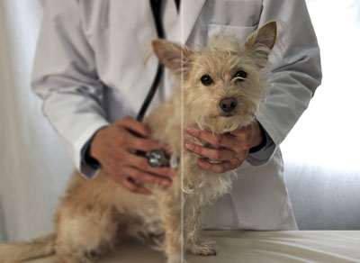
Retina Images | Veterinary Mobile Images
Are you asking yourself what high definition images are? High definition images, or retina images, are used specifically on mobile devices like tablets and cell phones. Depending on the phone you have in your pocket, your screen size may be as large as the computer screen you have at home. This is because the pixels are placed next to each other much closer than your monitor at home. That gives your phone a brighter and more vivid display.
Retina images are images that are larger, and more detailed for mobile devices so the photo quality outscales what they will ever see if they view your practice's website on a desktop or laptop. Over 46% of searches are done on a cell phone exlusively. This means your visitors will be able to see crisp and clear images rather than the photo automatically adjusting to their incredibly large screen size, and making the pictures, your logo, etc. appear blurry. This can cause your viewers to not get a good first impression, and may ultimately lose you business because the website wasn't designed properly with a mobile friendly website in mind.
Don't lose customers because of something as simple as a blurry image. Make sure your veterinary mobile website is retina ready, and all your photos are crisp, clear and easily viewable. If you're interested in learning more about high definition images, how they apply to mobile websites, or would like to generate more customers, contact Vet Pro Sites today.